Brioulla Olive Oil Branding and Packaging
Brioulla Olive Oil
Branding, Logo, Package,
Client: Brioulla Olive Oil
Graphic Design: Özgün Özpınar
Client: Brioulla Olive Oil
Graphic Design: Özgün Özpınar
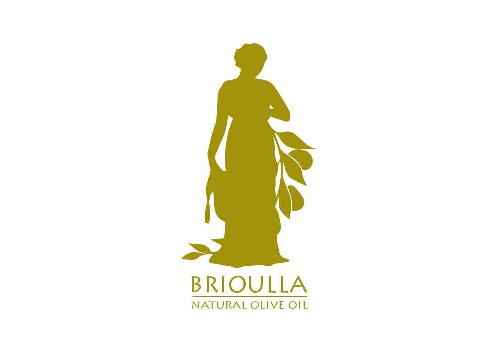
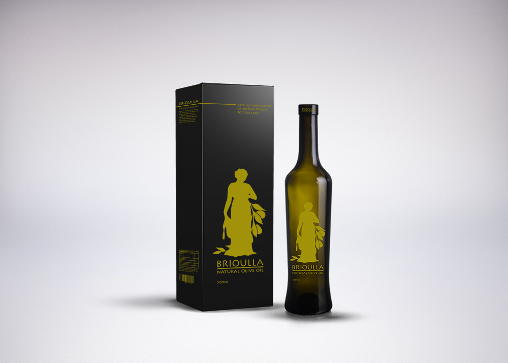
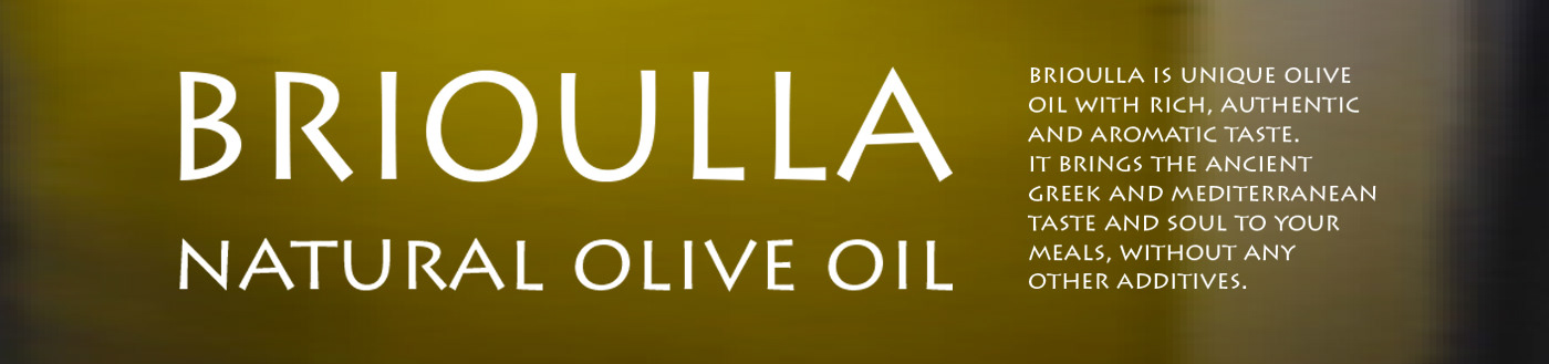
Brioulla Olive Oil named after an Aegean antique city aims to deliver priceless Mediterranean olive oil to Asia and Asia Pacific countries such as India, Sri Lanka, Pakistan, Malaysia and Indonesia. For Brioulla whose target audience consists of people with high income, a logo and product package have been designed.
According to a target audience analysis which has been conducted for one of Turkey’s rare organic olive oil producers Brioulla, the colours green and black has been selected which represents nature, organic agriculture and nobility. To meet the expectations of the company, the design has been completed with a woman figure inspired by ancient Greek statues and symbolising pure beauty of nature.